Multi-level-sidebar with indents
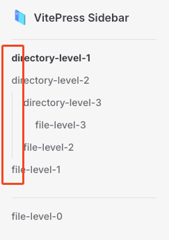
In a multi-level sidebar, the menu is displayed with indentation for each tier. However, VitePress starts indenting from the second tier by default. For example:

Above, directory-level-2 is a subfile of directory-level-1, but it appears to be in the same hierarchy.
This is not an issue with VitePress Sidebar, so to fix it, you'll need to customize the styling of your existing theme via VitePress' Custom CSS.
Create a theme directory in the .vitepress directory to override the styles required by the existing styles. Then, inside the theme directory, create an index.js file (If you're using Typescript, use index.ts instead of index.js) and a custom.css file.
/
├─ package.json
├─ src/
├─ docs/
│  ├─ .vitepress/
│  │  └─ theme/            <------------ Add this
│  │     ├─ custom.css     <------------ Add this
│  │     └─ index.js       <------------ Add this
│  ├─ example.md
│  └─ index.md
└─ ...
Then add the following to the index.js file:
import DefaultTheme from 'vitepress/theme';
import './custom.css';

export default DefaultTheme;
Next, add the following to the custom.css file:
.group:has([role='button']) .VPSidebarItem.level-0 .items {
  padding-left: 16px !important;
  border-left: 1px solid var(--vp-c-divider);
  border-radius: 2px;
  transition: background-color 0.25s;
}
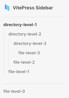
Now start the VitePress server. This will make it easier to see the hierarchy of the first level of the group where the child content exists.

It's important to note that the vertical divider you see here was only created with CSS; it should have been created as a div with a CSS class called indicator, so you should be aware that the vertical divider may not be selected when you build dynamic pages in the future.